Ecommerce
Magic Spoon: Landing Page Teardown with Optimization Tips to Improve Conversion Rate
Yvonne Wu |
February 06, 2023
Attracting visitors to your website and then converting them into buyers is no easy feat. As a marketer, one wrong move can cause potential customers to hit the back button on their browser faster than you can say "Magic Spoon"!
If you're tired of seeing your landing page's conversion rate suffer and want to know how to turn it around, then this blog post has all the answers for you - a deep dive teardown of Magic Spoon's landing page with plenty of optimization tips that will help add some magic sauce to make sure your traffic isn't just feeding pigeons.
What We Love About Magic Spoon’s LP
On-Brand LP Design
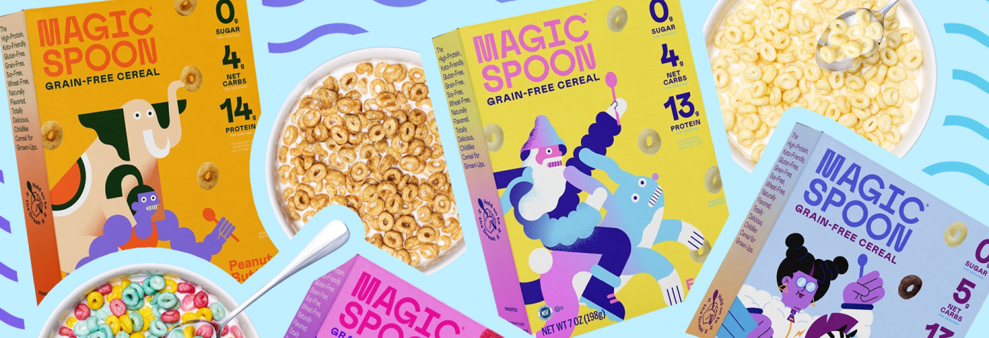
Magic Spoon has created an impressive LP design that stays true to the brand's identity. A mix of captivating colors and a clean layout ensures an aesthetically pleasing browsing experience on the page.
Clear Value Props with Captivating Product Shots
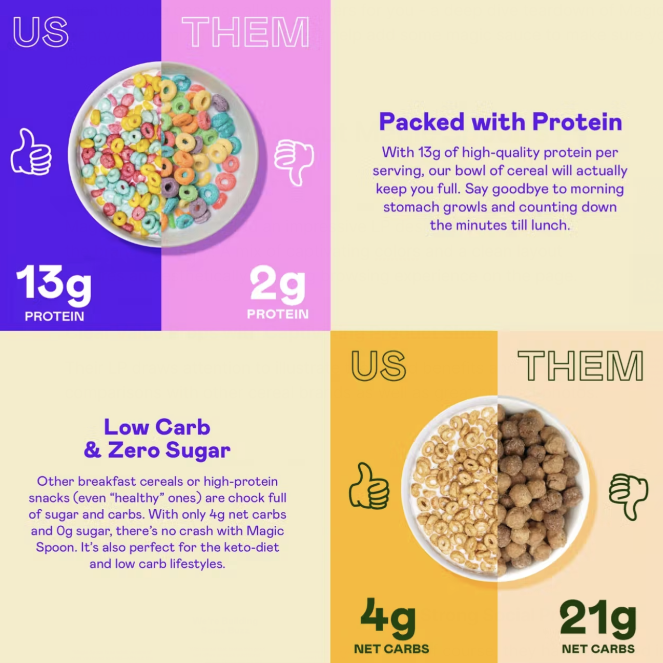
Their LP draws attention to illustrate their food benefits and comparisons with other cereal brands as well as great product photos.
Strong Social Proof
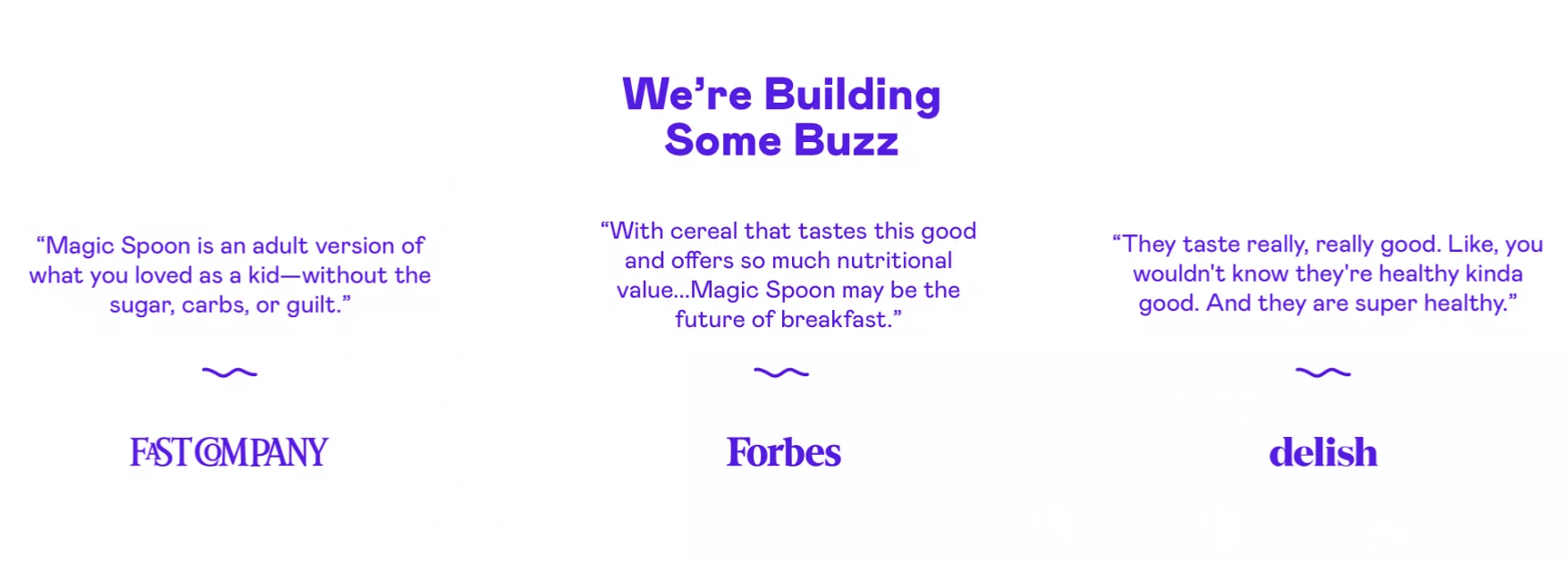
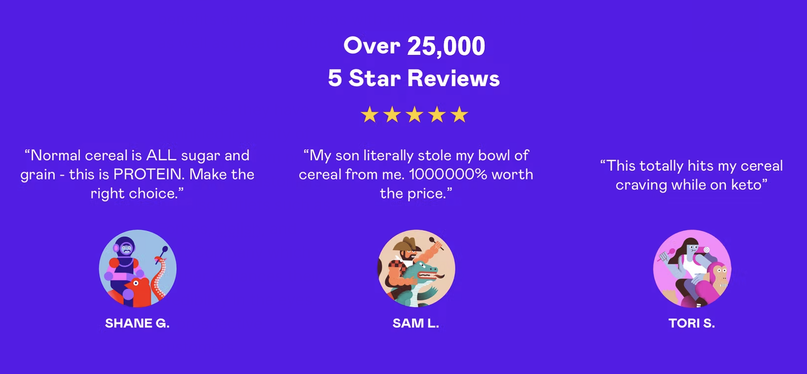
Of course, they have sprinkled in plenty of social proof from not only exiting customers but also outlets such as Forbes, Delish, and Fast Company which further enhances their credibility in the eyes of prospective customers.
Relatable Messaging
Magic Spoon also includes elements of reminiscence through its messaging, so this connective appeal easily resonates with consumers who grew up with cereal.

Featured Bundles with High AOV
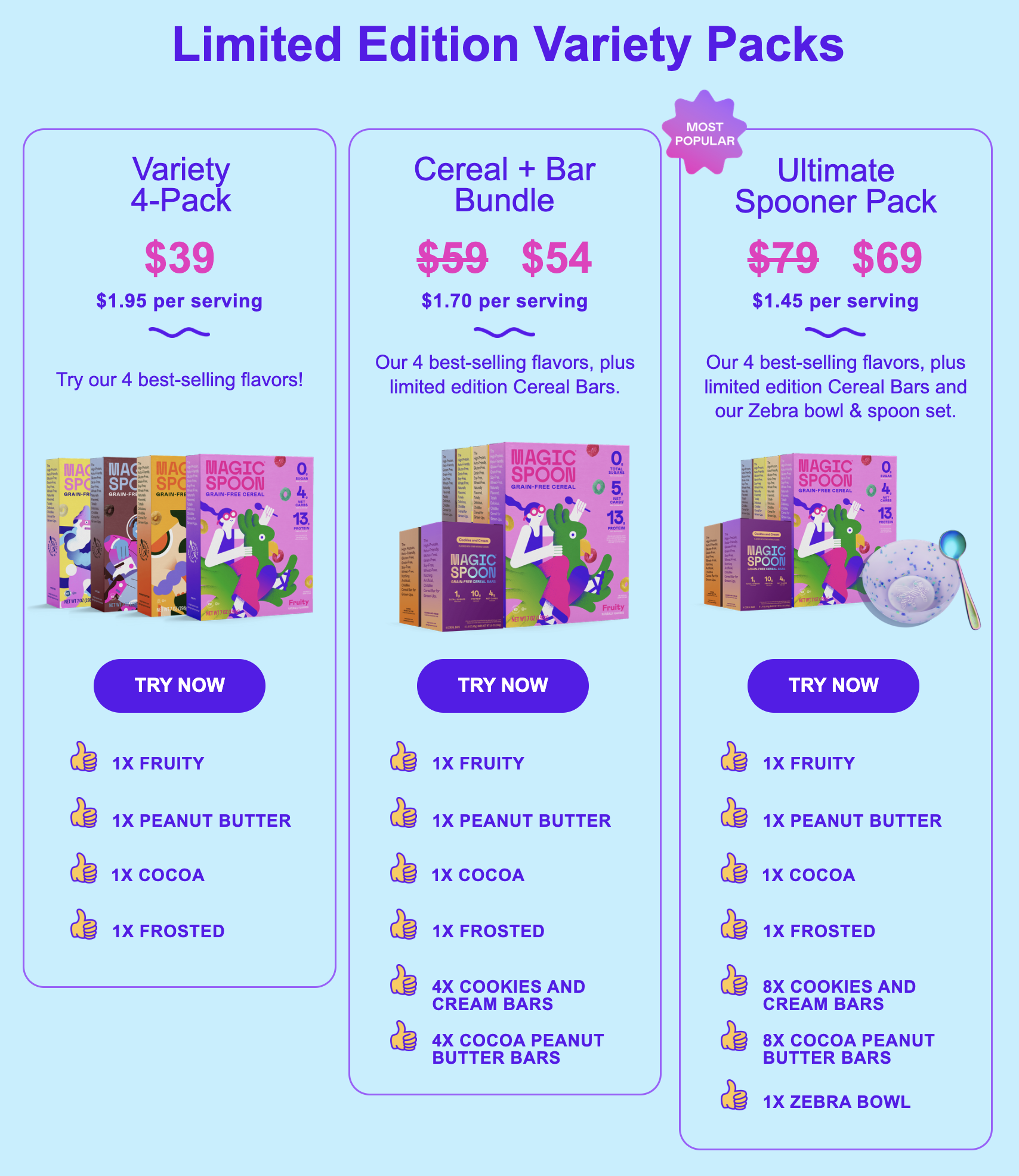
The brand also features their product offerings towards the bottom of the landing page. They split their offering into convenient bundles instead of showcasing individual products, which increases average order value when customers decide to purchase.
The LP also emphasizes savings by using strike-through pricing – that encourages customers to purchase with financial incentives. Lastly, Magic Spoon makes sure to emphasize their most expensive bundle by making it front and center with a “most popular” badge - this little touch often guides shoppers to the most profitable bundle before anything else.
Optimization Tips to Improve Magic Spoon’s LP
Optimize The Space Above The Fold
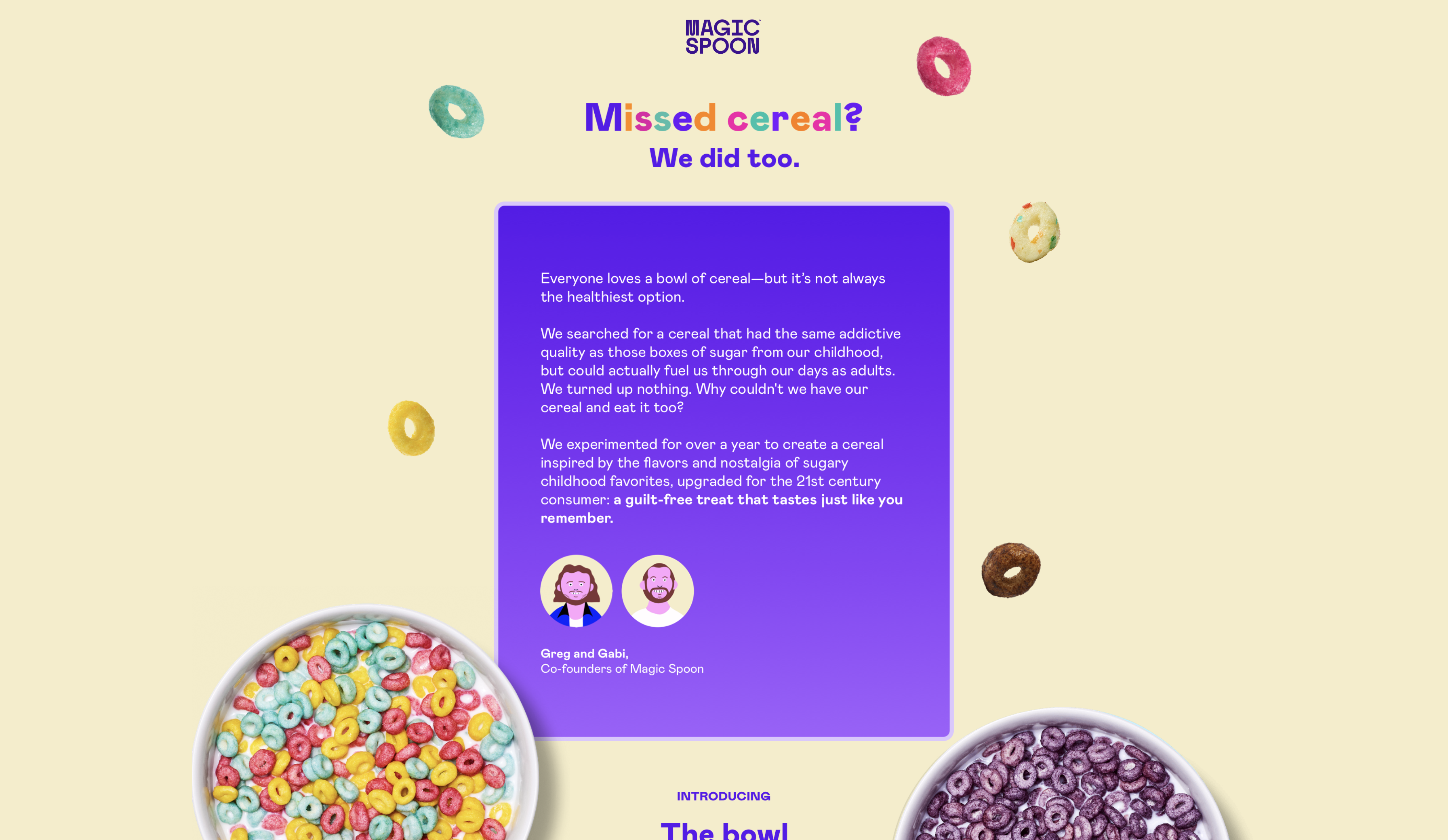
A crucial change Magic Spoon can make to its landing page is optimizing the space above the fold by adding a CTA. There is currently no call-to-action in the first fold, but this is an important tool that directs customers in a certain direction such as learning more about your products or making a purchase.
Make Your Value Props Actionable with More CTAs
Additionally, improving the customer journey by including additional CTAs throughout the page makes it easier for them to take action as they learn more about Magic Spoon�’s value props and benefits.
The hero, social proof sections, and footer (where it says “Happiness 100% Guaranteed”) all are excellent places to add compelling calls-to-action that will help your customers move through the buyer's journey quickly and efficiently - create a sense of urgency with phrases such as "Try now" or "Order today"!
A/B Test Value Props that Drive the Most Conversions
Currently, Magic Spoon’s hero features a letter from its founders on the mission of the brand. Although it does a good job explaining the story and purpose of the brand, it’s not very skimmable. Without a text headline or subheadline, you force people to read small print copy.
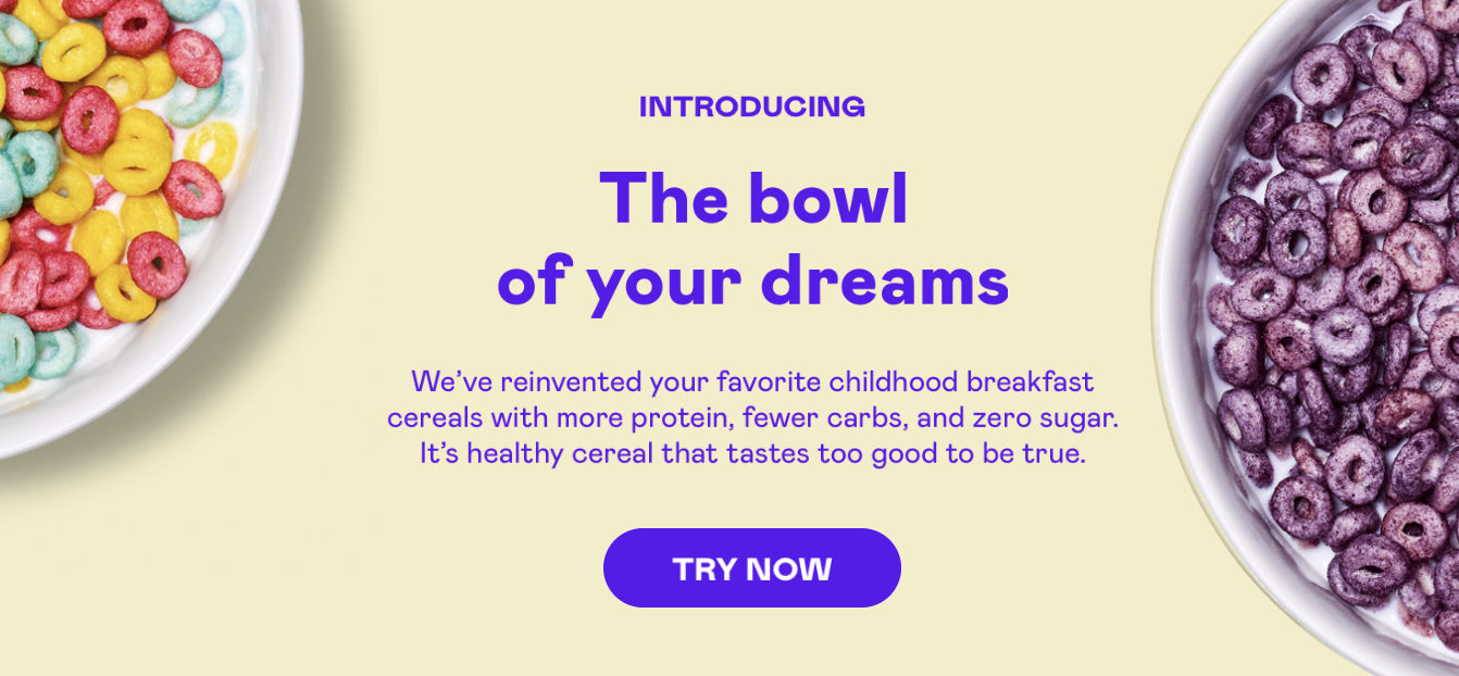
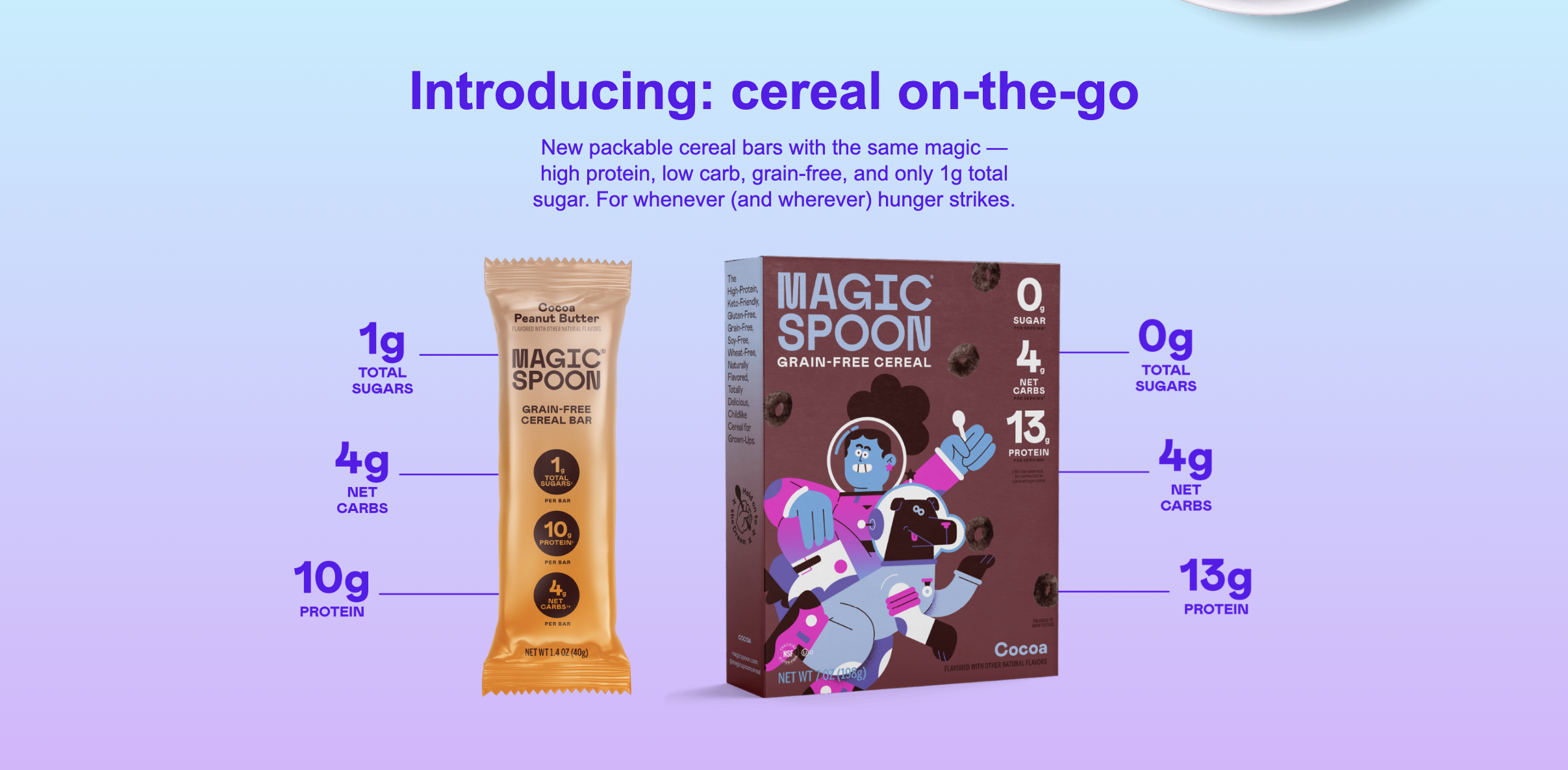
Additionally, the founder letter is not the strongest way to present Magic Spoon’s key benefits easily and quickly. Instead, we recommend testing the following as LP heros where key value props are called out with larger font. Your value props needs to stand out! Try using large text for your headline and small text for your body text. It also helps to add more sense of design to the page.
Are you ready to grow your brand?
If you've been scratching your head about how to increase your conversion rates, we hope this blog post provided some clarity. CRO is a key element of scaling any website's performance and thus, revenue for the business.
It can be tricky to figure out where to start or what will work best for your specific situation - and that's where we come in. Our team specializes in providing clients with tips and tricks that will help boost their conversion rates. So if you're ready to improve your website or landing page, contact us today - we guarantee you won't regret it!
Let's TalkGet in touch with us to scale your business
Let's ChatLike what you see?
